You can't plot CRM contacts on a map natively in HubSpot, Mailchimp, or Shopify. The data exists - the visualization layer doesn't. A standalone map tool lets you draw radius circles, see contact heatmaps, and export filtered segments back to your CRM in minutes instead of hours.
You can't plot CRM contacts on a map in HubSpot, Mailchimp, or Shopify - and most marketing teams don't realize it until they need to.
You have 5,000 contacts in HubSpot. You want to find everyone within 50 miles of Austin for an upcoming trade show. You start filtering. By city. By state. By ZIP code. Three hours later, you have a spreadsheet that's "close enough."
That's the modern CRM workflow, and it's broken.
What is CRM map visualization?
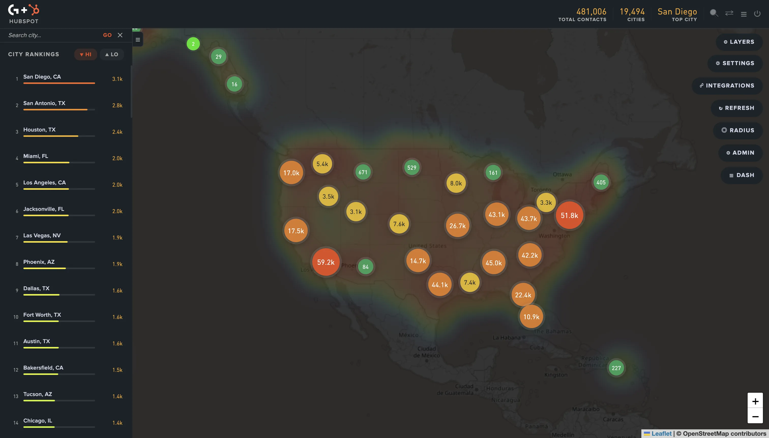
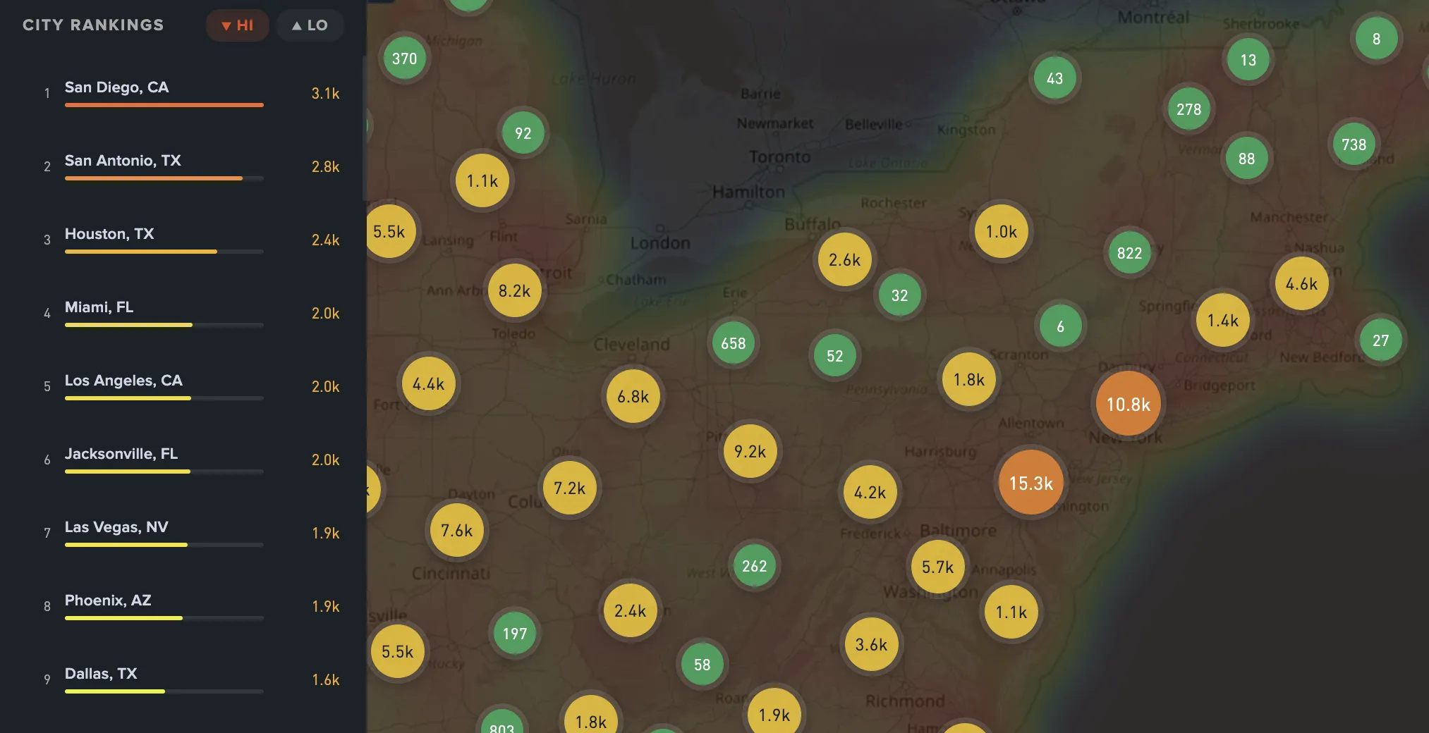
CRM map visualization is the practice of plotting customer or contact records from a CRM platform - HubSpot, Mailchimp, Shopify, Salesforce - onto an interactive map. The map typically supports heatmaps for density, radius circles for distance-based selection, and region or state pickers for geographic segmentation.
It's a feature most marketing teams expect to find in their CRM. None of the major platforms ship it natively, even though every modern CRM stores enough address data on each record to render one. We built GeoList specifically to close that gap after years of running into the same wall managing Shopify storefronts and HubSpot CRM campaigns for entertainment industry clients.
Why don't HubSpot, Mailchimp, or Shopify show contacts on a map?
None of these platforms include native geographic visualization because their core workflow is record management - contacts, deals, lifecycle stages, email automation - not spatial analysis. Building a map view is a different engineering investment than refining list filters.
You can verify this in their docs:
- HubSpot's contact filtering supports city, state, and ZIP fields - no map view
- Mailchimp's audience tools use location fields without a map UI
- Shopify customer reports filter by region but don't render geographic visualizations
The data has been there for years. The visualization layer hasn't been built. According to Salesforce's State of the Connected Customer report, 78% of customers expect personalized engagement from brands they buy from. Geographic context is the foundation of "personalized" for most use cases - and it's the layer most CRMs treat as an afterthought.
What does mapping CRM contacts look like in practice?
A working CRM map visualization workflow has four primitives:
- Heatmap rendering - density of contacts per area, visible at a glance
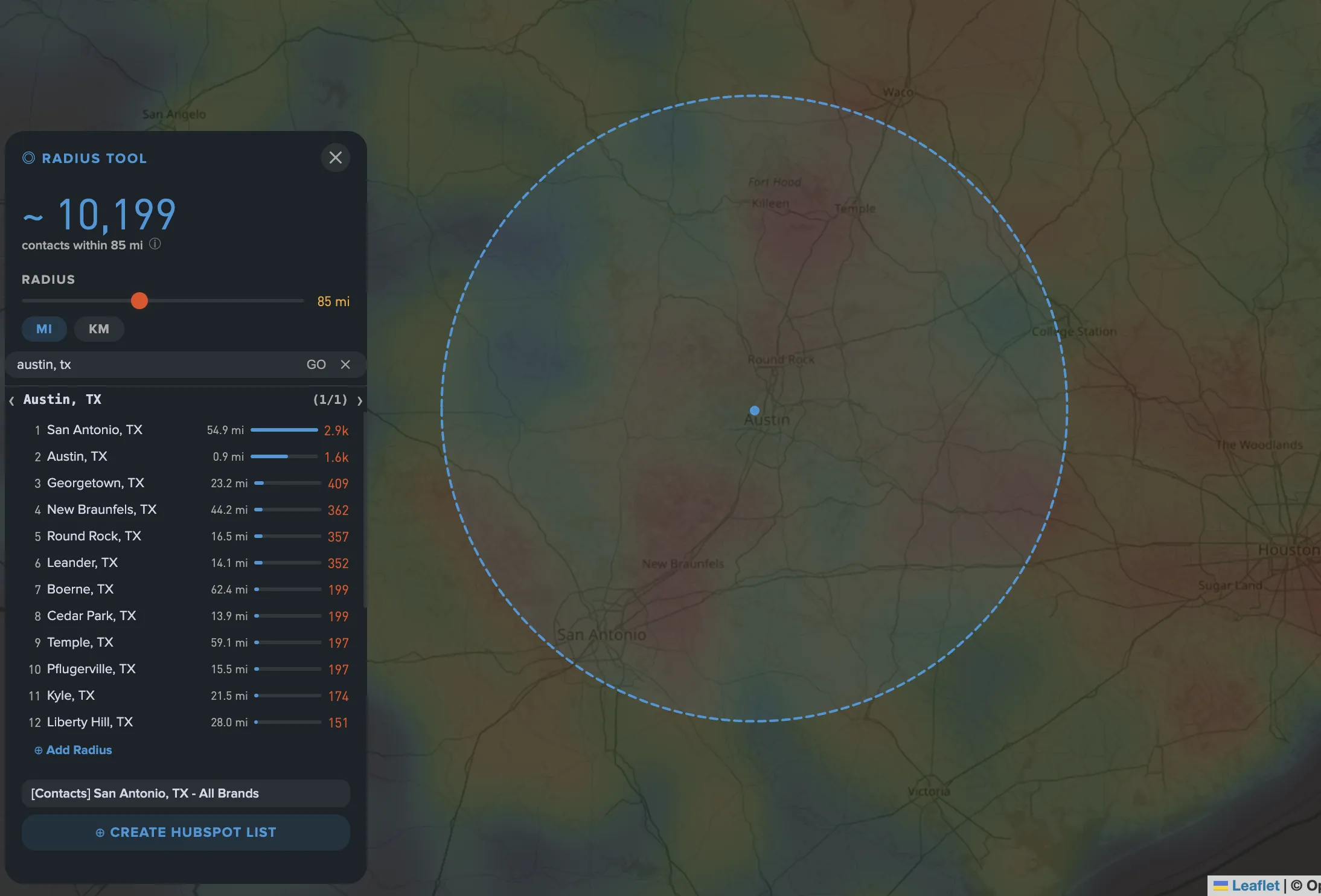
- Radius selection - draw a circle of N miles around a point, capture every contact inside
- State or region selection - click a state or multi-state region, get the contained contacts
- Export back to CRM - take the resulting segment and create a list, audience, or campaign source in HubSpot, Mailchimp, or Shopify
You can technically build this yourself with the Google Maps Geocoding API, your CRM's REST API, and Python. We've done it. It takes a senior engineer about three days to make it work and another week to make it stable. That's why a tools layer exists.
State, ZIP, and map filtering compared
The choice isn't whether to geographically segment - it's how granular the segmentation should be. Each option gives up something:
| Method | Granularity | Speed to use | Best use case |
|---|---|---|---|
| State filter | Roughly 6.6 million people per state on average across the 50 US states | Instant in any CRM filter UI | Wholesale "everyone in California" campaigns where audience uniformity doesn't matter |
| ZIP filter | About 7,500 people per ZIP code across more than 41,000 active ZIPs | Tedious - manually selecting 200+ ZIPs to cover a metro is impractical | Hyper-local mailings, single-neighborhood targeting, or store-level radius approximation |
| Map radius | Custom 1-500 mile circles drawn around any coordinate or address | Instant when the right tool is connected to your CRM | Trade shows, store openings, drive-time campaigns, regional event invites |
| Custom polygon | Any shape - multi-metro, irregular regions, custom-drawn territories | Instant when tooled, impossible without | Multi-metro regional rollouts, sales territories that don't follow state lines |
The right granularity is usually a radius or polygon, not a state. California alone is roughly 770 miles long; a "California campaign" treats San Diego buyers and Sacramento buyers as one audience. They don't share weather, dialect, drive times, or buying patterns.
4 things you can't do without a CRM map
1. Trade show targeting
You're sponsoring a conference in Phoenix. You want everyone within driving distance to know about your booth. Filter by state = AZ and you miss San Diego customers who'd happily drive over - you also include Flagstaff customers who won't drive 2 hours. A map lets you draw a 100-mile radius around the venue and capture exactly the right group in one click.
2. Sales territory planning
You're hiring a regional rep for the Southeast. Where do your existing customers cluster - Atlanta? Charlotte? Both? Spread across 12 secondary cities? Without a heatmap, you're guessing or running pivot tables. HubSpot's research on sales territory design repeatedly points to geographic clustering as one of the top inputs reps use when prioritizing accounts - which is hard to do from a state filter. We walk through the full 4-step territory design workflow in our post on sales territory planning with CRM map data.
3. Local product or store launches
A retail brand opens a new store in Denver. They want to email everyone within 25 miles. A state filter (CO) is too coarse. Manually selecting Denver-metro ZIPs is tedious. A radius around the store address solves it in 30 seconds and pulls a clean export for an email send.
4. Expansion mapping
Where is your competitor strong but you have no presence? Map your contacts, then look at the gaps. Geographic gaps in a CRM are often the first signal of where to invest next. They're invisible in a state-by-state count. We walk through the full 3-step workflow in our post on finding expansion opportunities in your CRM data.
How to plot CRM contacts on a map (the manual way)
If you don't have a tool, here's how it gets done today:
- Export contacts from CRM to CSV
- Strip down to relevant fields - name, email, postal address
- Geocode each address into latitude/longitude using a service like the Google Maps Geocoding API or Nominatim
- Load the geocoded CSV into a tool like Google My Maps, Mapbox, or Tableau
- Apply visual filters or selection inside that tool
- Export the filtered subset back to CSV
- Import into your CRM as a new list
This works. It also requires API keys, scripting, and 4-8 hours per pull. Every time the CRM updates, you start over.
A real example: planning a 12-city tour
A music merch brand uses HubSpot for fan email. The artist is doing a 12-city tour. The marketing team wants to email fans within 30 miles of each venue with show details and merch promos.
Without a map view - export 100,000 contacts to CSV, look up venue ZIP codes, write a Python script with the Maps Distance API to filter by 30-mile radius per venue, build 12 separate segments, import each back to HubSpot. A senior dev does this. Estimated time: 1 day.
With a map view - open the contact map, draw 30-mile circles around each of the 12 venues, click Export per venue, paste each into HubSpot as a list. A junior marketer does it. Estimated time: 20 minutes total.
The output is identical. The cost gap is roughly 24x.
How GeoList solves CRM map visualization
GeoList is the tool we built to close this gap. It connects to HubSpot, Mailchimp, or Shopify, syncs your contacts, and gives you a map view of everything your CRM was already storing but never letting you see.
It supports:
- Contact heatmap by state and city
- Radius circles around any address or coordinate
- State and multi-state region selection
- City rankings (top cities by contact count)
- Export back to your CRM as a list, audience, or segment
It runs as a standalone web app. Authenticate once via OAuth, sync your contacts, and you have the map view your CRM should have shipped years ago. You can see GeoList in action, read more on the OptimizeMe blog, or reach out to ask questions.
Bottom line
If your contact database has 5,000+ records and your customers are spread across more than three states, you're leaving decisions on the table every time you skip the map.
State-level filtering is the spreadsheet of geographic targeting - functional in 1995, painful in 2026. The data has been sitting in your CRM the whole time. Look at where your customers actually are.
Frequently asked questions
HubSpot itself has no native contact map view. Their App Marketplace lists a handful of integrations - most are read-only or limited to address verification rather than full map-based segmentation. For interactive map visualization with radius selection, contact heatmaps, and bidirectional list export, a standalone tool like GeoList is the typical solution.
Mailchimp's audience segments support country, state, ZIP, and city filters but not custom radius. To create a "within X miles of Y" segment in Mailchimp, you need to export the audience, geocode each contact, filter externally, then re-import the resulting list as a new audience tag. A connected mapping tool removes those steps.
Modern geocoding services (Google, HERE, Nominatim) are roughly 95-98% accurate when the source address is complete and well-formed. International contacts and PO boxes degrade accuracy. Most CRM data is reliable enough for radius targeting at 25+ miles, where minor geocoding errors don't move a contact across the boundary.
For one-off projects, yes - you'd need someone comfortable with the Google Maps API, geocoding workflows, and basic Python or JavaScript. SaaS tools like GeoList abstract this away so non-technical marketers can run map-based segments without engineering involvement. The trade-off is flexibility - custom GIS work handles edge cases that off-the-shelf tools won't.
A heatmap is one visualization mode of CRM map data - it color-codes contact density across regions so concentrations are visible at a glance. A full map can additionally support markers (one dot per contact), radius selectors, polygon drawing, and shape-based selection. Both rely on the same underlying geocoded contact data, but the use cases differ - heatmaps for analysis, full maps for selection and export.