Find expansion opportunities in your CRM data by plotting existing customers on a map, identifying high-density zones (your proven ICPs), and looking for adjacent geographies with similar characteristics but no current customer presence. State-level CRM filters hide these patterns. A heatmap surfaces them in minutes.
You can find expansion opportunities in your CRM data by mapping existing customers, finding the dense zones, and looking at the gaps next to them. Most growth teams skip this analysis because their CRM doesn't show contacts on a map and pivot tables don't reveal geographic patterns at the right resolution.
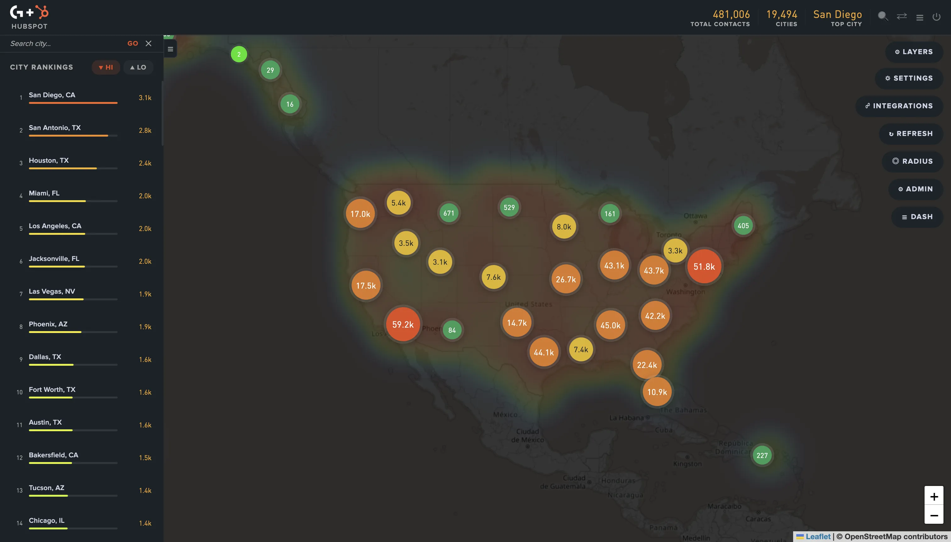
You have 5,000 contacts in HubSpot. You know roughly which states they're in. You don't know where the actual concentrations are within those states, where your customers cluster across state lines, or which adjacent metros look like expansion targets. That's the gap a map closes in 30 seconds.
What is CRM expansion analysis?
CRM expansion analysis is the process of using your existing customer data to identify new geographic, vertical, or segment opportunities you haven't yet penetrated. The geographic version specifically looks at where your customers cluster and where similar-looking regions have no customers, treating the gaps as expansion targets.
Done well, expansion analysis turns your CRM from a record-keeping system into a growth map. Done poorly, it produces state-by-state pivot tables that miss the real signals. (If you're still evaluating which CRM to build this analysis on, this guide to choosing the right CRM for your business is a good starting point.)
Why state-level filters hide expansion opportunities
Most marketing teams default to state-level segmentation because it's the only granular geographic filter their CRM offers natively. The problem: states aren't markets.
| Geographic granularity | What it shows | What it hides |
|---|---|---|
| State count | Customers per state across 50 buckets | Metro-level concentration within states (Austin vs. Houston are very different markets, both inside Texas) |
| ZIP filter | Hyper-local customer presence | Multi-state metros (NYC spans NJ + NY + CT) and regional patterns |
| Map heatmap | Density across the country at metro resolution | Nothing meaningful - this is the right granularity for expansion |
| Custom polygon | Custom-drawn territories | Nothing - works for any expansion shape |
A "California campaign" treats San Diego buyers and Sacramento buyers as one audience. A state-level expansion plan treats "we need to grow in Texas" as a single project, when in reality Austin tech-buyer expansion and Dallas enterprise expansion are different go-to-market motions.
The right granularity for expansion analysis is metro-level, which means a heatmap or a radius-based view, not a state filter.
The 3-step expansion analysis workflow
This works for any CRM that has city, state, or ZIP data on contacts.
Step 1: Plot your existing customers on a heatmap
Pull your customer list and render it on a US map with density coloring. The brightest spots are your proven ICPs in geographic terms - places where your product has already won customers without you specifically targeting that area. Don't filter by deal stage at this point; include all customers (or all qualified contacts if your CRM doesn't separate stages cleanly).
What you're looking for: 3-7 distinct density clusters. Most B2B SaaS companies cluster naturally around 2-5 metros even when their messaging implies national reach.
Step 2: Identify the high-density zones (your proven ICPs)
For each cluster, write down what's true about it. Industry mix, company size, dominant verticals. If your top cluster is metro Austin, the question is "what makes Austin work for us." Tech-heavy buyers? Recent VC funding? Concentration of mid-market companies? The answer becomes your ICP signal.
The clusters tell you who buys you. The shape of the clusters tells you why.
Step 3: Look for adjacent gaps with similar characteristics
Now look at metros next to your dense clusters that have zero or near-zero customer presence. For each adjacent metro, ask: does it share characteristics with my dense cluster? If yes, it's a strong expansion target. If no, it's not - the gap is real but the metro isn't a fit.
Examples of "lookalike" metros:
- Austin → Boulder, Raleigh, Salt Lake City (tech-heavy, mid-market, growth-stage VC presence)
- Boston → Cambridge spillover, Providence, Hartford (research/biotech corridor)
- Atlanta → Charlotte, Nashville, Birmingham (Southeast B2B clusters)
The lookalikes are where targeted outbound, paid acquisition, or partner programs have the highest probability of working because the customer ICP already proves out in similar conditions next door.
A real example: a B2B SaaS finding a Texas opportunity
A hypothetical mid-market B2B SaaS has 2,800 customers concentrated as follows:
- 380 in Austin metro
- 220 in Boston metro
- 190 in Seattle metro
- The remaining 2,000 spread across 40+ smaller metros
The state-level CRM filter says "we have strong presence in Texas, Massachusetts, and Washington." That's true but unhelpful for expansion.
The map view reveals something different: Austin is dense, Houston has 25 customers, Dallas has 18, San Antonio has 6. Houston and Dallas are large mid-market business hubs that share a lot of Austin's demographic profile but the SaaS hasn't penetrated them. The state-level reading says "Texas is solved." The map reading says "Austin is solved, Houston and Dallas are wide open."
That's a different go-to-market plan. The map view turns one undifferentiated state into three distinct metros with different penetration levels and three different expansion playbooks.
Why most teams skip this analysis
Three reasons:
- Their CRM doesn't show contacts on a map (HubSpot, Mailchimp, and Shopify all store the data but don't render it geographically)
- Manual geocoding + external mapping tools (Google My Maps, Mapbox, Tableau) takes 4-8 hours per refresh
- Building a custom map view in-house requires the Google Maps Geocoding API, CRM API integration, and ongoing maintenance
Without a connected mapping tool, the analysis costs more in time than the typical growth team can justify, so it doesn't happen.
How GeoList automates this workflow
GeoList connects directly to HubSpot, Mailchimp, or Shopify, syncs your contacts, and renders the heatmap automatically. The 3-step workflow above takes about 10 minutes total instead of 4-8 hours of manual work.
It supports:
- Contact heatmap by state and city
- City rankings (top metros by customer count)
- Radius circles around any point to model "what if we expanded 100 miles around our densest metro"
- State and multi-state region selection for territory planning
- Direct export back to your CRM as a list, audience, or campaign source
Common mistakes in expansion analysis
- Filtering by state before plotting on the map. This pre-bins the data and you lose the cross-state patterns. Plot first, filter second.
- Treating raw customer count as the only signal. A metro with 10 customers may be more strategic than one with 50 if the 10 are higher-value or more recently won. Layer in deal size or LTV when you have it.
- Confusing density with opportunity. Your densest cluster is not always your biggest expansion target - it might already be saturated. The biggest opportunities are usually adjacent to dense clusters, not inside them.
- Skipping the qualification step. Geographic adjacency alone doesn't make a metro an ICP fit. Check that the lookalike metro shares the demographic, vertical, or business-stage characteristics of your dense cluster.
Bottom line
Your CRM has been telling you where to expand for years. State-level pivot tables have been hiding the answer. A 10-minute map view of your existing customer base usually surfaces 2-4 high-confidence expansion targets that wouldn't appear in any other view of the data.
If your contact database has 1,000+ records and your customers are spread across more than three states, run the 3-step workflow on your CRM this week. The expansion targets are sitting in your data right now.
Frequently asked questions
For the geographic clustering pattern to show meaningful signals, you need roughly 500+ customers spread across at least 10 metros. Below that threshold, the patterns are too noisy to base expansion decisions on. Above 5,000 customers, the patterns become very stable and the analysis becomes increasingly valuable.
Both, but the analysis usually points to one or the other depending on shape. If your densest cluster has 30%+ market share already (rare but possible in narrow verticals), expansion to lookalikes wins. If your densest cluster is at 5-10% penetration, deepening that market usually has higher near-term ROI than starting fresh elsewhere. The map shows you which scenario you're in. Once you've identified the geographic shape of the opportunity, the same map data feeds directly into sales territory planning - the next step in the workflow.
ICP analysis looks at firmographic and behavioral characteristics of your best customers (industry, size, stage, behavior). Geographic expansion analysis is one input into ICP refinement - it tells you where your ICP currently lives. The two work together: ICP characteristics tell you who; geographic analysis tells you where; combining the two tells you where to go next.
GA gives you visitor location, not customer location. The two correlate but aren't the same - you may have heavy traffic from regions where you have zero customers, and dense customer clusters in regions where your traffic is light. CRM data reflects who actually buys you, which is the expansion signal that matters.
For one-off projects, Mapbox, Google My Maps, and Tableau all support customer mapping if you can geocode and import the data. HubSpot's contact filtering gives you the source data but no map view. GeoList is purpose-built for this analysis with direct CRM integration. The trade-off is between flexibility (custom GIS work) and speed (purpose-built SaaS).